

CONTEXT
Oneflow's product suffered from unclear microcopy across critical user moments, leading to confusion, support tickets, and feature drop offs.
PROBLEM
Discovery:
Audited product copy, reviewed support tickets
Finding:
Duplicated terms, mixed tones, poor visual hierarchy
Root causes:
No shared voice, terminology, or patterns
Teams creating content in silos
Why this:
Slow onboarding, high support costs, underutilized features
MY ROLE & APPROACH
My role: Content Designer,
Team: Product, Marketing, Sales, Support
Approach:
Led the content audit
Identified and documented content issues
Prioritized fixes
Redesigned content
Validated solutions through user testing and card sorting
Created reusable patterns for the style guide
RESULTS AND IMPACT
29%
↓ Support tickets
19% to 13% destructive tickets
Measured: Freshdesk
33%
↓ Repeat errors
30% to 20% repeat visits within 10 mins, analytics
Measured: Analytics
12%
↑ Feature adoption
Empty state engagement increased
Measured: Analytics
THE PROCESS
I led the content audit and partnered with PMs, Designers, Engineers, CSM, and Support to identify and fix the highest-impact content issues.
Audit
Prioritize
Validate
Scale
Audited dialogs, errors, empty states, panels
Prioritized fixes with PMs using a simple impact/effort matrix

Validated with open card sorting (12 CSMs + users).

Redesigned content and tested with users for validation.
Scaled patterns into style guide + design system for team members to maintain consistency.
Constraints and trade-offs
No module restructure possible (keeping forest-green headers)
No backend changes possible (postponing email redesign)
Prioritized clarity over brevity (e.g., explicit verbs over short labels).
KEY CONTENT CHALLENGES AND SOLUTIONS

Before: Flat list, no visual hierarchy, actions mixed with content
The Participants & Settings side panels were cluttered
Participants had flat lists with no hierarchy. Settings lacked grouping and consistent labels.
Impact: Users wasted time scanning; onboarding slowed.
Solution: Structured, scannable participant view
Participants tab: I introduced hierarchy and separated actions
Settings tab: Grouped settings based on user mental models from card sorting
Result: Faster onboarding, less CSM support.

After: Participants labeled, grouped by signing party, clear action separation. Settings categorized.
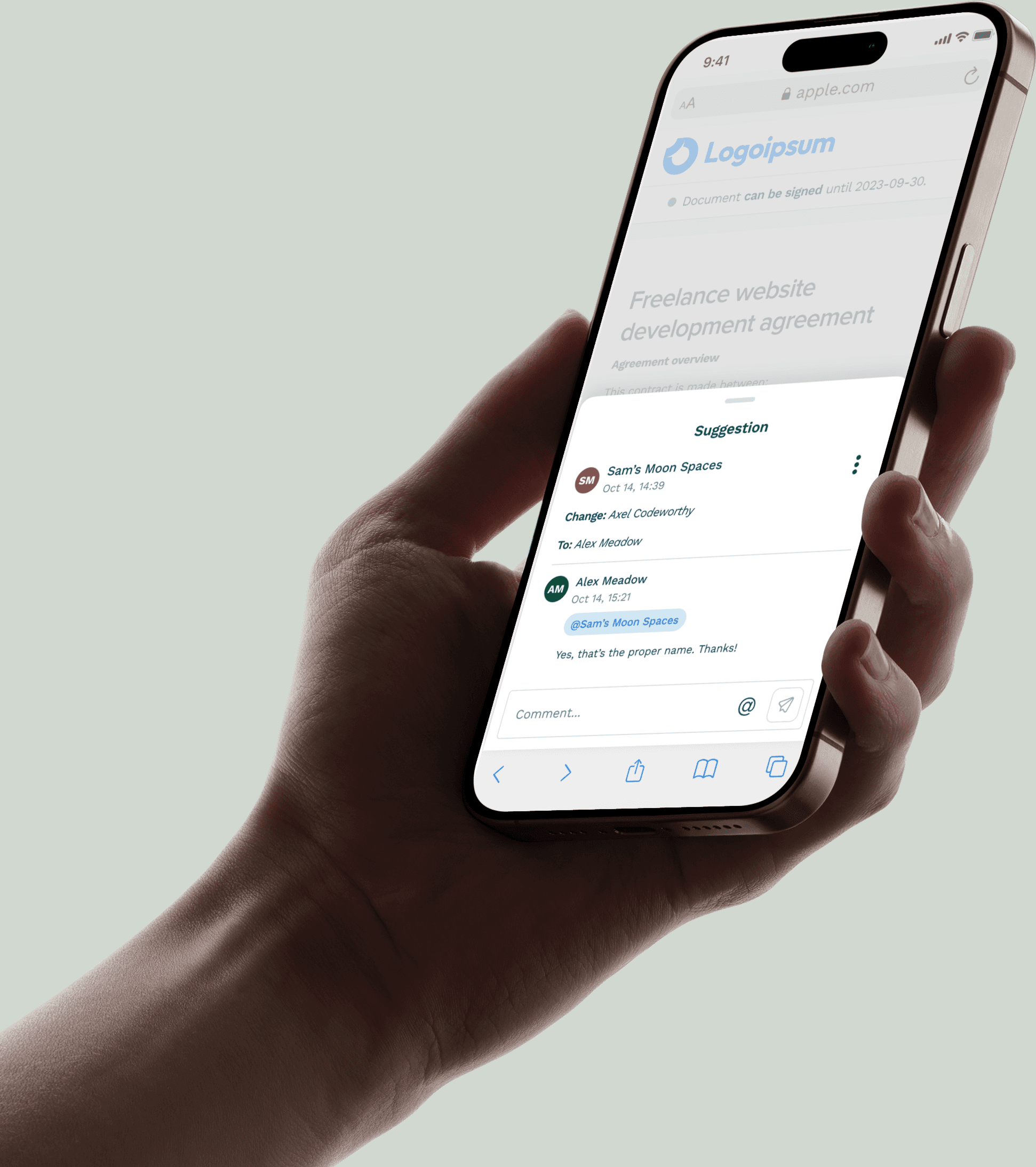
Destructive dialogs were vague
Dialogs used short, unclear headers and buttons like “Confirm” or “Close.” Users second-guessed destructive actions like deletion.
Impact: 19% of support tickets on destructive actions stemmed from unclear dialogs.

Before: Vague headers, generic "Confirm" dialog/button

After: Explicit action "Delete document?", verb-first button labels
Solution: Clearer, verb-first dialogs
I rewrote destructive dialogs to start with explicit verbs (“Delete document?”), added cancel safety net.
Result: Tickets on destructive actions dropped from 19% to 13%.
Error pages failed to guide users
Errors had placeholder text like “Something went wrong.” No guidance, no recovery.
Impact: 30% of repeat visits happened within 10 minutes. Users stuck.

Before: Generic error 'Something went wrong', no context or next steps
Solution: Human, actionable error pages
I rewrote all error pages to explain the issue, guide recovery with empathic copy + CTAs.
Result: Repeat visits dropped from 30% to 20%. Faster recovery, stronger trust.

After: Specific errors explain the issue, provide actionable recovery steps
Empty states didn’t move users forward
Empty states simply described the absence of data, but gave no next step.
Impact: Features unused - users didn’t know next steps.

Before: Described absence ("Nothing here yet")

After: Invited action ("Start by adding a document")
Solution: Action-oriented empty states
I redesigned empty states to action-oriented (“Start a chat,” “Create a document”).
Result: 12% increase in feature adoption (Q1 to Q2 2022).
LEARNINGS AND REFLECTIONS
Worked well
Prioritizing by support ticket volume + user pain gave us immediate wins
Card sorting with CSMs (not just end users) revealed critical domain-specific mental models
Scaling patterns into the style guide ensured impact beyond this project
Would do differently
Start with error messages. They had the highest repeat rate (30%) but I tackled them mid-project
Involve Legal earlier for compliance-sensitive copy like signing flows
Set up tracking for feature adoption metrics before launch
Learned
Content audits should prioritize business impact (support costs) + user pain, not just what's "broken"
Small content changes (button labels, error copy) have disproportionate impact on user trust and feature adoption
MORE PROJECTS

Designed and built by me